| | [Class] Queenie's Class #1: Simple Header |    |
|
|
| Author | Message |
|---|
Neo Queen Serenity Founder
 
Title : Lady of the Forums Posts : 8297 Join date : 2011-06-14 Age : 33 Location : Northern California
![[Class] Queenie's Class #1: Simple Header Empty](https://2img.net/i/fa/empty.gif) |  Subject: [Class] Queenie's Class #1: Simple Header Subject: [Class] Queenie's Class #1: Simple Header ![[Class] Queenie's Class #1: Simple Header I_icon_minitime](https://2img.net/s/t/21/09/42/i_icon_minitime.gif) 30th December 2014, 6:20 pm 30th December 2014, 6:20 pm | |
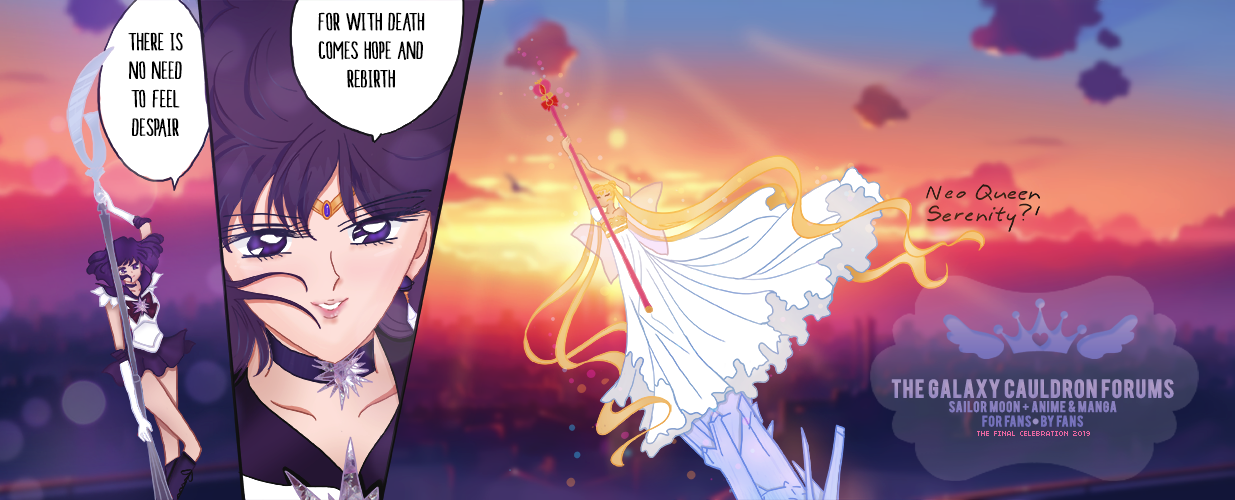
| Hello and welcome to the first Graphics Class on GC! I'm going to say this will require a large amount of reading to get started and is intended to by more along the lines of an actual class rather than a drawn out tutorial. Please take time to read everything so that there is no confusion once we get started. The header we will be making this class can be previewed here. As you know we will be following a simple guide on how to create a header for the forums. Here is the over view of information you will need to know about this class:
- I only own and use Adobe, although not required please be aware much of the terms I use are from Adobe.
- All graphics we work on will be listed in pixels for the dimensions.
- The header is 1235 pixels wide and 400 pixels high.
- There is a total of 7 layers and 2 text layers.
- I will provide all the images that you will need as we reach the step that uses them.
- This is may be considered a semi advanced course, I will try my best simplify every step we do.
- An advanced program will be needed for this course. (photoshop, gimp, paint.net) You will need to be able to *create layers, **add text, and change ***styles/overlays.
- If anything above is 100% foreign to you, you may see below for a generic explanation from myself. That being said some extra research may be needed of your end, or you may simply let me know if this class is too much for you.
- To start the class, each step will have a 24 hour period to complete it, nothing here is complex enough to require more than this time. If you have trouble keeping up with this, please post saying you will be late on the assignment. You can fall behind by a total of 3 days before I will drop you from the class. The rest of the students who keep up with the class will need to post as they finish so I know when to move on. If you don't post an explanation I'll consider it as a drop.
- As a reward for putting up with me and taking time to take the class I will be awarding points to all those who complete the class.
- If you have a question or concern please post with in the class so if others have it I can answer it as one.
* Layers - With many works of art, there is a process in "building up" a piece of art. The background, the sketching, the basic fill in of colors, and shading. These can be seen as layers. Ours will include
- background
- objects that go behind the subject (2 of these layers)
- the subject
- vibrancy adjustment
- a layer of color set to "lighter color"
- image set to "lighten".
I will explain these layers later in the class. The importance of layers is to allow us to make adjustments even after we feel a piece is finished. ** Text - There must be a "text" feature on your program. I will be using 2 fonts that will need to be installed before use. If you can not do this I will provide alternate fonts that should come standard, or you will have to do the research on your own. Adding new fonts if a very very valuable trait to have! I highly suggest you learn this skill. - Adobe PC: you will need to find download the font and move it to ( C: --> Program Files --> Common Files --> Adobe --> Fonts). Simply installing a new font to your computer will not add it to the Adobe photoshop program. - Adobe Mac: I do not own a Mac, so please click here to see a tutorial. *** Change Layer Styles - When you create a layer, there is a feature that lets you change how it interacts with the layers beneath it. I will be using a solid color that will affect any areas of the images that are darker than it. The effect will making them lighter as well as add a purple hue to them. I will also be using an image with a similar affect on top of that solid color layer. In Adobe "Layer Styles" also apply to various preset things that can make your job much easier. The ones we will be using are called a "drop shadow" and "stroke". I will explain these further down the line once we have a need for them. Now that the basics are covered (Unless I forgot something, which is highly possible) let's get started on the first "****assignment"! January 11, 2014 - Assignment #5 Due January 13 9am PST
- Please start by saving these two images. Image One and Image Two. Make sure they are saved as .png.
- As before, add these two to the overall header document (psd) we are working in.
- The solid color should be above Vibrancy, and the Texture should be above the Solid Color. Your Layer Order should look like this.
- Set the Solid Color layer to "Lighter Color" (NOT LIGHTEN!!!) and the Opacity to 42%. Preview of Settings
- Set the Texture (Layer 7) to "Lighten" and don't touch the Opacity.
- Take a Screen shot or save the image an upload as normal.
Notes on today's assignment: Point one is about the Solid Color Layer. Please note there ARE other ways of achieving this look. What this layer is doing is what I described above in the opening segment of this class. It's lightening all areas that are darker than it and adding a purple tone to them. This helps is bringing all the colors closer together and makes them more similar to each other. This is especially useful when you have two images or elements in your graphic that don't match in tone and/or coloring. I almost always try a lighter color, and play with how I want the layer to be. Ie, "Lighten" "Screen" "Lighter Color" "Overlay". Knowing what looks good and how colors interact when set to these various settings comes with lots of practice and playing around. So experiment!! Point two is about Textures and what I did for this image with one. The background I created for this class header is what some would call a texture. Textures are amazingly helpful, just make sure you know the rules for using one when you save them. I used a texture as an overlay in this case instead of a background. When I first added this image I didn't know what exact thing I wanted it to do. As with the Solid Color, I tested it on many different layer settings, but settled for a simple "Lighten". However as you'll notice when looking at this image, there is a see through section around the subject. I Used the eraser brush to help take away from of the effects since it was too bright. These are the brushes I use to erase AND to make my backgrounds. [spoiler="Old Assignments"] January 05, 2014 - Assignment #4 Due January 06 by 8pm PST
- We are going to add a new vibrancy layer today. Look for this symbol and click on it, then on "vibrancy".
- (Another way to do this is to click on Layers - New Adjustment Layer (Adjustments) - Vibrancy
- The Vibrancy is set to "+92" and the Saturation is set to "+17".
- Post a screenshot or the image.
That is all for today. A few notes on today's lesson. If you are using Gimp, I can not seem to find consistent information on if this is available and where. It's seems as though 2.8 MAY come with an option like this, but I was unable to find one. The reason I chose to add vibrancy to this image is because I for one enjoy bold colors, and secondly because they causes natural contrast. Before we added the adjustment it was leaning towards "monocolor" rather than bold. Most humans will always enjoy and prefer things with contrast in them, whether between colors or the light and dark areas. You CAN go too much into the "contrast" area, when that happens you start loosing definition in your subject, either washing them out or blacking them out. Almost 95% of my graphics are touched up with Vibrancy and Saturation. Of the Two Saturation is always the one I change the least. - Old Assignments:
January 02, 2014 - Assignment #3 Due January 03 by 8pm PST Today we will be adding a drop shadow and a png to the image. 1. Download image 1 and image 2. 2. Image one is a "drop shadow"*. Using the same method as before (copy and paste) OR dragging it into the canvas, add it to our main image. 3. Repeat the same with the png** of image 2. 4. Now we have to make sure that our image layers are in the right place now. The subject should be the top most layer, followed by the drop shadow, then the flower png, then finally the background. The order should look like this: https://i.imgur.com/dGJxeKs.png 5. Once your layers are in order, move the drop shadow to be about a quarter of an inch to the right of the subject. You can see the first post for how it's supposed to look. 6. Now we need to balance*** the flower png to be about in the middle of the subject and it's drop shadow. Once again, take a look at the first post where our final header image goal is and see if you can come close. 7. Upload your image or your screenshot. * Drop Shadow - Yes there are many ways to do this, in this instance, once my subject was cut out, I made sure I had the Rectangular Marquee tool selected and the subject layer selected. I right clicked, chose "Load Selection", and this gives me the shape of the subject in a selection. In a new layer I used the paint bucket to fill in the selection. The main reason I chose to add a drop shadow is because the subject and the colors of the background are similar and I wanted to create separation between them and to add a little depth to it. ** This was one 1 flower png from a png pack I downloaded AGES ago. I used the image twice and changed it's size both times, and once I was done I merged the layers. ( If you select both layers you want to merge, hit ctrl + e) Pngs is the graphic term for cut out images, typically things like flowers, and such. *** Balance is something I too into account when sizing and placing my flowers. If you look at how the subject's hair falls you'll see I mimic how it flowed. She has more flowy hair on the bottom left vs the smaller amount of hair in the upper right. I chose to size and place my flowers to accent that. Another alternative would have been to reverse and mirror them. Aka the smaller flower above the large amount of hair on the left and the larger flower on the bottom right under the smaller amount of hair. These are just things you learn by moving things around, getting feedback, looking at other people's work. December 31, 2014 - Day 2 Assignment. Due by January 1st at 7pm PST.
- Save this image right here. This is going to be called the "subject". It is a png meaning it has no background. BE SURE TO SAVE IT AS A .PNG
- Open the image in the same program you used before.
- Make sure the background image file we did yesterday is open as well.
- Now for the subject image, If you press ctrl+a you will select the whole image.
- Once the whole image is selected (the whole square) press ctrl+c (or Edit -> Copy)
- Now move to the background from yesterday and press ctrl+v (or Edit -> Paste). The subject should now appear in the center of the image.
- Look for the "move tool" or (shortcut "v" for my cs5 on pc). It looks like this image does right here.
- Once you have found the tool, move the subject to the left until there is about an inch between it and the left hand edge. (approximately 175px from the edge)
- Now save your image as a png and let me see what we have.
December 30, 2014 - Day 1 Assignment. Due by December 31st at 7pm PST.
- Post that you have read and understood all of the above as well as what program you will be using. This will count as your attendance for the day. This is the time to ask any questions you may have.
- Save/Download this image right here. This is the background we will be using.
- Once on your computer, open this image with the program you will be using (typically by a right click --> open with). By doing this, it will automatically set the dimensions you need for the rest of the class.
- Once you have open the document, be sure to save it as what ever you want your work to be called. If you are using adobe photoshop, I would save as a .psd
- Start thinking about which site you will be using to upload your progress shots on, I highly recommend: http://tinypic.com/ or https://imgur.com/ as both place do not require an id to use and are reliable. Forumotions image uploader is NOT the best and is NOT recommended.
**** All future assignments will be added to the main post from now on. #ag #agclass
Last edited by Neo Queen Serenity on 11th January 2015, 12:57 pm; edited 5 times in total |
|
 | |
Neo Queen Serenity Founder
Title : Lady of the Forums Posts : 8297 Join date : 2011-06-14 Age : 33 Location : Northern California
| | Subject: Re: [Class] Queenie's Class #1: Simple Header 30th December 2014, 6:27 pm | |
| ADDITION TO ASSIGNMENT 1!!!
Tell me what program you are using. |
|
| | |
Guest Guest
| | Subject: Re: [Class] Queenie's Class #1: Simple Header 30th December 2014, 6:28 pm | |
| R&U
Are we going to be told which text to use and where we can download them at? I'm not sure i have the right ones is all.
Also i use a Mac for all my art and graphics work, if the tutorial didn't help someone I'd be happy to help out if needed.
I use Photoshop CS6 |
|
| | |
Brit-chan Senior Member
Small Lady Emeritus
 
Title : Queen of the Cat Kingdom Posts : 23236 Join date : 2011-06-23 Age : 36 Location : Lafayette, LA
| | Subject: Re: [Class] Queenie's Class #1: Simple Header 30th December 2014, 6:29 pm | |
| R&U! I use Photoshop CS5. - Sailor Dancer wrote:
- - Adobe PC: you will need to find download the font and move it to ( C: --> Program Files --> Common Files --> Adobe --> Fonts). Simply installing a new font to your computer will not add it to the Adobe photoshop program.
And I'm not sure about others computers or versions of Photoshop but whenever I install a new font on my computer it adds it to Photoshop right away. I use Photoshop CS5 and its worked on all versions previous to that. Could be different with newer versions of photoshop though. Going work on the first assignment now. ^_^ |
|
| | |
Neo Queen Serenity Founder
Title : Lady of the Forums Posts : 8297 Join date : 2011-06-14 Age : 33 Location : Northern California
| | Subject: Re: [Class] Queenie's Class #1: Simple Header 30th December 2014, 6:30 pm | |
| As we reach each assignment I will provide the images, or links needed, this includes the links to the two texts to download. |
|
| | |
Sailor Seren Lotus Crystal
 
Title : ❤ Sailor Ceres ❤ Diana's Wife ❤ Posts : 1713 Join date : 2014-07-15 Age : 28
| | Subject: Re: [Class] Queenie's Class #1: Simple Header 30th December 2014, 6:31 pm | |
| |
|
| | |
Neo Queen Serenity Founder
Title : Lady of the Forums Posts : 8297 Join date : 2011-06-14 Age : 33 Location : Northern California
| | Subject: Re: [Class] Queenie's Class #1: Simple Header 30th December 2014, 6:37 pm | |
| - Sailor Rudolph wrote:
- R&U! I use Photoshop CS5.
- Sailor Dancer wrote:
- - Adobe PC: you will need to find download the font and move it to ( C: --> Program Files --> Common Files --> Adobe --> Fonts). Simply installing a new font to your computer will not add it to the Adobe photoshop program.
And I'm not sure about others computers or versions of Photoshop but whenever I install a new font on my computer it adds it to Photoshop right away. I use Photoshop CS5 and its worked on all versions previous to that. Could be different with newer versions of photoshop though. Going work on the first assignment now. ^_^ I've had trouble in the past, but it's good to know it works like it's supposed on some computers! Hopefully no one will need to follow that path. |
|
| | |
Brit-chan Senior Member
Small Lady Emeritus
Title : Queen of the Cat Kingdom Posts : 23236 Join date : 2011-06-23 Age : 36 Location : Lafayette, LA
| | Subject: Re: [Class] Queenie's Class #1: Simple Header 30th December 2014, 6:45 pm | |
| Oh also should we post just the image or wait until the next instructions? I feel silly posting an image you are already linking to. I probably just read too much into the stuff. xD |
|
| | |
Neo Queen Serenity Founder
Title : Lady of the Forums Posts : 8297 Join date : 2011-06-14 Age : 33 Location : Northern California
| | Subject: Re: [Class] Queenie's Class #1: Simple Header 30th December 2014, 6:55 pm | |
| - Sailor Rudolph wrote:
- Oh also should we post just the image or wait until the next instructions? I feel silly posting an image you are already linking to. I probably just read too much into the stuff. xD
Nope, just save it for now. ^^ I thought about it, but as you said, it'd be silly and no way for me to know if people actually followed the directions. |
|
| | |
leohamasaki Star Seed
 
Posts : 99 Join date : 2012-11-23 Age : 36 Location : Brazil
| | Subject: Re: [Class] Queenie's Class #1: Simple Header 30th December 2014, 7:09 pm | |
| Hey there! Read the rules and I understood them all. I'm going to use Photoshop CS5. ![[Class] Queenie's Class #1: Simple Header 3322474402](/users/2914/10/33/88/smiles/3322474402.png) |
|
| | |
Tiny Kitten Diana Emeritus
 
Title : I live between the lands of Fantasy and Delusion. Seren's wifey <333 Posts : 4886 Join date : 2014-02-13 Age : 31 Location : In the year 5.5 slash Apple slash 26.
| | Subject: Re: [Class] Queenie's Class #1: Simple Header 30th December 2014, 7:58 pm | |
| Read and Understood!
I use Photoshop Creative Cloud and Gimp, depending on what I'm doing! I'm not sure of the versions since I'm.on my phone but if that's a required thing to list I'll add it in tomorrow xD
Super excited!! |
|
| | |
yunbuns Lotus Crystal

Title : Queen of da Norf. Posts : 3068 Join date : 2014-02-26 Age : 30 Location : Who knows.
| | Subject: Re: [Class] Queenie's Class #1: Simple Header 30th December 2014, 8:03 pm | |
| |
|
| | |
Princess Luna Lotus Crystal

Title : GC's official Luna. Posts : 8228 Join date : 2012-02-29 Age : 31 Location : Conshohocken, Pennsylvania
| | Subject: Re: [Class] Queenie's Class #1: Simple Header 30th December 2014, 8:31 pm | |
| R&U
I will be using Photoshop CS5 |
|
| | |
Princess Makoto Lotus Crystal

Title : GC official Lurker Posts : 1353 Join date : 2011-09-30 Age : 37 Location : Southern Louisiana
| | Subject: Re: [Class] Queenie's Class #1: Simple Header 30th December 2014, 9:09 pm | |
| R&U
Photoshop CS5
Very excited to start this class! |
|
| | |
mysteryloveandjustice Lotus Crystal

Title : GC's Official Seiya/Sailor Star Fighter <3 Posts : 2849 Join date : 2012-09-25 Age : 30 Location : Amidst the ancient pines
| | Subject: Re: [Class] Queenie's Class #1: Simple Header 30th December 2014, 9:12 pm | |
| R&U!  And I use Adobe Photoshop CC ^^ |
|
| | |
Princess Makoto Lotus Crystal
Title : GC official Lurker Posts : 1353 Join date : 2011-09-30 Age : 37 Location : Southern Louisiana
| | Subject: Re: [Class] Queenie's Class #1: Simple Header 30th December 2014, 9:47 pm | |
| Oh yes, and question. Is a drawing tablet required for this? |
|
| | |
Sailor Neptune Outer Senshi Admin
RP Graphics & Canon Admin
 
Title : Drinker of Roleplayers' Tears ~ The Internationaliest™ Posts : 9577 Join date : 2013-07-25 Age : 36 Location : Canada
| | Subject: Re: [Class] Queenie's Class #1: Simple Header 30th December 2014, 10:14 pm | |
| R&U
I use Adobe Photoshop CS5 Extended |
|
| | |
Neo Queen Serenity Founder
Title : Lady of the Forums Posts : 8297 Join date : 2011-06-14 Age : 33 Location : Northern California
| | Subject: Re: [Class] Queenie's Class #1: Simple Header 30th December 2014, 10:16 pm | |
| - PrincessMakoto wrote:
- Oh yes, and question. Is a drawing tablet required for this?
All images will be pre-cut for you in png format. ^^ there are 3 total and I've already taken care of them ^^ |
|
| | |
Neo Queen Serenity Founder
Title : Lady of the Forums Posts : 8297 Join date : 2011-06-14 Age : 33 Location : Northern California
| | Subject: Re: [Class] Queenie's Class #1: Simple Header 30th December 2014, 10:24 pm | |
|
- Radicaledward124 - Checked in. Photoshop
- Sailor Rudolph - Checked in. Photoshop
- Sailor Seren - Checked in. GIMP 2.8
- leohamasaki - Checked in. Photoshop
- Sailor Blitzen - Check in. Photoshop & Gimp
- Yunie - Checked in. Photoshop
- Princess Luna - Checked in. Photoshop
- PrincessMakoto - Checked in. Photoshop
- mysteryloveandjustice - Checked in. Photoshop
- Sailor Snowflake - Checked in. Photoshop
Princess Moon is the last person. This class should be much easier since photoshop is the common program. Once again, I would highly recommend looking into Adobe Photoshop's free CS2! http://www.redmondpie.com/download-adobe-photoshop-cs2-for-free-legally-while-you-still-can/ |
|
| | |
Princess Moon Lotus Crystal

Title : ✖ The name's Vivid Posts : 3199 Join date : 2014-12-14 Age : 24 Location : Germany
| | Subject: Re: [Class] Queenie's Class #1: Simple Header 31st December 2014, 2:17 am | |
| I'm sorry that I'm so late - It was night here and I slept too long :'D R&U I use GIMP 2.6  |
|
| | |
Neo Queen Serenity Founder
Title : Lady of the Forums Posts : 8297 Join date : 2011-06-14 Age : 33 Location : Northern California
| | Subject: Re: [Class] Queenie's Class #1: Simple Header 31st December 2014, 10:14 am | |
| Don't worry, you weren't late, I will take in account who has finished and who hasn't to see if we can move on early, you had plenty of time left and we have a very wide variety of time zones so don't sweat it. Due to us finishing early I'll be posting the next step in a short while |
|
| | |
Neo Queen Serenity Founder
Title : Lady of the Forums Posts : 8297 Join date : 2011-06-14 Age : 33 Location : Northern California
| | Subject: Re: [Class] Queenie's Class #1: Simple Header 31st December 2014, 2:22 pm | |
| December 31, 2014 - Day 2 Assignment. Due by January 1st at 7pm PST.
- Save this image right here. This is going to be called the "subject". It is a png meaning it has no background. BE SURE TO SAVE IT AS A .PNG
- Open the image in the same program you used before.
- Make sure the background image file we did yesterday is open as well.
- Now for the subject image, If you press ctrl+a you will select the whole image.
- Once the whole image is selected (the whole square) press ctrl+c (or Edit -> Copy)
- Now move to the background from yesterday and press ctrl+v (or Edit -> Paste). The subject should now appear in the center of the image.
- Look for the "move tool" or (shortcut "v" for my cs5 on pc). It looks like this image does right here.
- Once you have found the tool, move the subject to the left until there is about an inch between it and the left hand edge. (approximately 175px from the edge)
- Now save your image as a png and let me see what we have.
Extra notes on today's lesson. PNGs - PNGs are very very helpful when saving images that don't have any background. Often times when an image is cut out it's called a "render" or on tumblr you will sometimes hear it called "transparent". They also have a better save quality. All my work is always saved as a png. (unless it's a .gif) When you past the Subject image into the background image from yesterday this should automatically create a new layer for you. If you can not see what "layers" I am referring to then please make sure you can see them ![[Class] Queenie's Class #1: Simple Header IqV6IEA](https://i.imgur.com/IqV6IEA.png) I keep my layers to the right hand side of the window, like so: ![[Class] Queenie's Class #1: Simple Header KZfvl0t](https://i.imgur.com/kZfvl0t.png) When it comes to adding new images, new pngs ( term for cut out images), new textures, etc I pretty much always use the same method of open in photoshop, ctrl+a, ctrl+c and then ctrl+V in the main place I'm working. I'm aware there are other ways of adding image and such but I'm self taught so this is my preferred method. If you have any questions please let me know :3 |
|
| | |
Neo Queen Serenity Founder
Title : Lady of the Forums Posts : 8297 Join date : 2011-06-14 Age : 33 Location : Northern California
| | Subject: Re: [Class] Queenie's Class #1: Simple Header 31st December 2014, 2:25 pm | |
| Oh a tip when using the move tool, it's slow, but I like to use my arrow keys when moving things left or right as to keep it with in the bounds of the image and not to have it move up or down and cause problems ^^ |
|
| | |
Sailor Seren Lotus Crystal
Title : ❤ Sailor Ceres ❤ Diana's Wife ❤ Posts : 1713 Join date : 2014-07-15 Age : 28
| | Subject: Re: [Class] Queenie's Class #1: Simple Header 31st December 2014, 2:32 pm | |
| Do we show you the actual image, or do we show it screencapped in the program? |
|
| | |
Neo Queen Serenity Founder
Title : Lady of the Forums Posts : 8297 Join date : 2011-06-14 Age : 33 Location : Northern California
| | Subject: Re: [Class] Queenie's Class #1: Simple Header 31st December 2014, 2:36 pm | |
| Either one is acceptable! Good Question, meant to say something ^^ |
|
| | |
Sailor Seren Lotus Crystal
Title : ❤ Sailor Ceres ❤ Diana's Wife ❤ Posts : 1713 Join date : 2014-07-15 Age : 28
| | Subject: Re: [Class] Queenie's Class #1: Simple Header 31st December 2014, 2:45 pm | |
| |
|
| | |
Neo Queen Serenity Founder
Title : Lady of the Forums Posts : 8297 Join date : 2011-06-14 Age : 33 Location : Northern California
| | Subject: Re: [Class] Queenie's Class #1: Simple Header 31st December 2014, 3:04 pm | |
| It looks good, I would however consider moving your subject more to the right. In a lot of art, it's been studied on what appeals to the human eye. Often times if the subject is placed in a zone called the 1/3 (or 2/3) rule, it appeals the most to us. Obviously all rules are meant to be broken, but it's a good guide line when finding how to balance an image. The closer something is to the edge of the image, the more "tension" it creates, we as humans read more into how close it is to the edge, rather than focusing on the image it's self. Here is a visual about the thirds rule. ![[Class] Queenie's Class #1: Simple Header DwOuruJ](https://i.imgur.com/dwOuruJ.png) My subject doesn't fall perfectly with in this rule, because I know I'm going to have a longer line of text, as well as image behind the subject to balance it out. |
|
| | |
yunbuns Lotus Crystal
Title : Queen of da Norf. Posts : 3068 Join date : 2014-02-26 Age : 30 Location : Who knows.
| | Subject: Re: [Class] Queenie's Class #1: Simple Header 31st December 2014, 3:17 pm | |
| |
|
| | |
Princess Luna Lotus Crystal
Title : GC's official Luna. Posts : 8228 Join date : 2012-02-29 Age : 31 Location : Conshohocken, Pennsylvania
| | Subject: Re: [Class] Queenie's Class #1: Simple Header 31st December 2014, 3:18 pm | |
| |
|
| | |
Neo Queen Serenity Founder
Title : Lady of the Forums Posts : 8297 Join date : 2011-06-14 Age : 33 Location : Northern California
| | Subject: Re: [Class] Queenie's Class #1: Simple Header 31st December 2014, 4:29 pm | |
| |
|
| | |
Sponsored content
| | Subject: Re: [Class] Queenie's Class #1: Simple Header | |
| |
|
| | |
| | [Class] Queenie's Class #1: Simple Header | |
|


![[Class] Queenie's Class #1: Simple Header JVJhTUc](https://i.imgur.com/JVJhTUc.png)
![[Class] Queenie's Class #1: Simple Header VhITVOg](https://i.imgur.com/VhITVOg.png)
![[Class] Queenie's Class #1: Simple Header Lesson10](https://i.servimg.com/u/f38/17/32/04/10/lesson10.jpg)

