One of the most overlooked pieces of graphic design is usability when in fact, it should be one of the first concerns when creating a digital image. A graphic can look amazing, but if it doesn't apply to or assist the audience, then it isn't very useful.
Identify the purpose of the graphic
The first thing to do is to identify the function of your graphic. What is its purpose? Is this graphic meant to be an important announcement, grabbing the user's attention? Is it meant to be an organized and neat navigation bar or is it simply there to add color and interest? Identifying the purpose helps you make solid design choices. For example, would you want to make the background of a website a very bright or even flashing color? Probably not, since the purpose of a website background is not to grab attention, but to lay a solid, unobtrusive foundation for the rest of the site.
Identify your audience
Graphics vary based on who they are made for. To better explain this, let's use the example of a website created for public transportation. To begin, we can ask ourselves "Who is going to need information about public transportation?" With a little brainstorming, we can figure out that the communities who might use this resource could be students, the elderly, people for whom English is a second language, children, and others.
Identify the needs of your audience
Now that we have identified some possible users of the website, we can ask ourselves what the needs of those users are. For example, the elderly may have diminished sight and difficulty reading websites with small text. Children or people for whom English is a second language may have difficulty navigating a website that is heavily text based. Students may want to know about discounts for transportation passes.
You can see in this example below that these concerns have been taken into account when designing. The text is large and easily legible and pictures accompany the text in the navigation bar, making it easier to understand. Important information, like the bus fare, is highlighted in a prominent place on the page.
These considerations are even easier to see when you juxtapose two images with different audiences and needs. First, let's look at this poster advertising an exercise program at a university.
Bright colors paired with sharp angles and images of active students make this poster feel energizing - which is great when you consider that its purpose is to promote fitness! Matching the color choices with the colors in the images is another great design choice here - it helps your eye move around the image, subconsciously forcing viewers to absorb all of the information. The text contains all necessary information and is large enough to be seen at a distance, which is important since this poster will be displayed on a wall in a university and will be seen from afar.
Now let's look at this poster which was part of a road safety campaign in Singapore. See the other posters in this series here.
![[Tutorial] Designing for Usability VmsM3YA](https://i.imgur.com/vmsM3YA.jpg)
This poster needs to get information across to many types of individuals - the citizens living in this area. It does this by using large text, illustrations to help understanding, and muted background colors which help the text to stand out. Imagine this poster, for example, in an energetic, neon pink - it doesn't convey the seriousness of the situation. That color choice would be inappropriate when you consider the purpose. One of my favorite aspects of this poster series is the image of the person in the center. Since this poster was part of a series featuring different individuals (such as a young student, a motorcyclist, and a bus driver) this design choice helps viewers identify with the poster and understand that the message applies to them. Her smile is an important aspect too, it helps this poster come off as a kind reminder, rather than an authoritative statement. It'd be an entirely different poster if she were giving us a stern look! Thinking of how images work in your composition is an integral part of design.
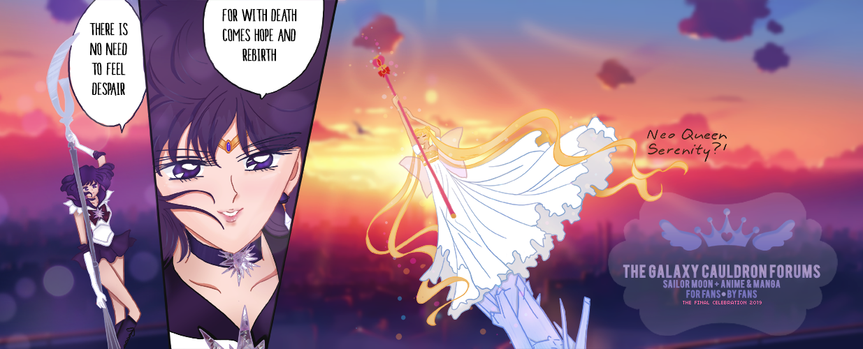
These considerations are not only important in website design, but are also important in the individual graphics used that make up the website. Here are some examples using graphics from the Galaxy Cauldron:
The forum header serves two purposes. The first is to deliver a strong, visual impact. It's the very first thing a new user will see when they visit the site. These considerations helped to inform its large size, strong imagery, and vibrant color choices. The second purpose is to inform someone of what the site is about. The text is large and prominent, serving that purpose nicely. You might ask yourself - is the text necessary, or couldn't it be smaller? Certainly, but imagine someone who is not very familiar with Sailor Moon or even forums who happens upon the site. They may only vaguely recognize the characters or wonder what type of website this is. The text makes these things clear.
![[Tutorial] Designing for Usability O2cXWLu](https://i.imgur.com/O2cXWLu.gif)
The Sanctioned tag is both small and brightly animated. It draws just enough attention to the thread, but stands out from other non-animated aspects of the site. Since it's an informative graphic and not, for instance, a site announcement, its size works well to convey its message. The animation makes it unique enough to catch your eye. Imagine if there were many graphics like this on GC. If that were the case, you might not notice this one. Restricting the use of certain types of graphics (for example by color, animation, or size) is another great way to make them even more useful.
Remember, taking these considerations into account does not mean that you have to sacrifice great or "pretty" design for usability. Instead, the two should go hand in hand to create a graphical experience that serves both form and function.


![[Tutorial] Designing for Usability 4011577294](/users/2914/10/33/88/smiles/4011577294.png)
![[Tutorial] Designing for Usability PnbI9Hl](https://imgur.com/PnbI9Hl.png)
![[Tutorial] Designing for Usability WBPak1H](https://i.imgur.com/wBPak1H.jpg)
![[Tutorial] Designing for Usability DsMzf2B](https://i.imgur.com/DsMzf2B.png)

