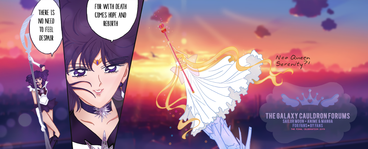
Usually when I use Gaussian blur it's to blur the background equally to bring more focus to the foreground, unless I want the viewers focus to be on the background than I blur the foreground.
I understand you randomly picked the Gaussian blur, however, what exactly were you aiming for when testing this out for the new banner?
I think having a gradual blur would look better, by that I mean have where the text is blurred, but the rest of her clear. The 'a' is also a little hard to see when against her jacket. Move it to the left with the 'a' on white for a clear view of the name.
The image choice and typeface is working well with what you have so far!


