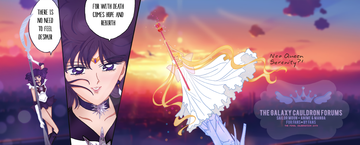
Nice improvement! Not sure what I would change. Maybe try to add a white border "inside", after the main red/ blue ones. Though it's not necessary I noticed it often makes the image and text pop out more like this:
![[Critique wanted] First time bumper making 9Ygs5yv](https://i.imgur.com/9Ygs5yv.gif)
It's a very useful trick when the border's colour seem to somewhat lose itself in the image (in the example above a lot of green).
In your case the border's colours seem to be enough bold to stand out. To be honest I am not sure how would it look like until I see. So I suggest trying to experiment a bit and see which one would look more 'pleasing' to the eyes


