Sailor Venus Inner Senshi Admin
Media Director
Title : AKA Haine~ the official hardcore UsaxMamo fan Posts : 3584 Join date : 2012-09-24 Age : 36 Location : The Echanted forest looking for my unicorn pet
![[Contest] LSMS ~ Winners Empty](https://2img.net/i/fa/empty.gif) |  Subject: [Contest] LSMS ~ Winners Subject: [Contest] LSMS ~ Winners ![[Contest] LSMS ~ Winners I_icon_minitime](https://2img.net/s/t/21/09/42/i_icon_minitime.gif) 8th December 2013, 11:43 am 8th December 2013, 11:43 am | |
| First of all, i'm sorry for taking so much time on this, usually i try to get everything on schedule, but this is actually my first time organizing this type of contest, so i guess that my lack good preparation lead me to this disastrous contest, so again, sorry guys, and thanks to all of you who participated and the ones who took some time to vote, i promise next LSMS will be on schedule =) And now the winner of the first ever LSMS Votes (both signatures): +15 ; -3 ; PC+5 = 17![[Contest] LSMS ~ Winners F6tmcLa](https://i.imgur.com/f6tmcLa.png) - Positive wrote:
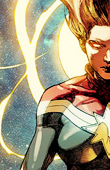
003
-I love that photo of Mamoru and the quote fits it very well. I also like the colors and the general composition of the signature. All in all, a very visually appealing signature.
-The text is readable, the colors flow together, its bold without being overpowering, and it has Tuxie's sweet sexy face. 
-The colors are vibrant and that immediately catches attention. The texts also helps bring in a nice balance to the overall placement of objects.
-I liked this one the most because I really like how the text and image are used together. The text is easily readable and the image is crisp and not overwhelming.
-I loved the picture chosen for this signature and the colors matched very well too. There are not too much words in there but just enough to create a good balance. Of of the reasons why this one came second for me is because it is something I expected to see. We could not predict any of the other signatures but I expected to see this. More classic. It is good yet it played a little bit against the final score to me.
-It has an obvious focal point which draws your attention -- your eyes know where to look. I love the contrast of the red and other bright colors against the dark-colored signature. I absolutely love the quote, it reminds me of La Reconquista and sounds like it came straight out of Mamo's mouth 
-The text and the image are balanced. the contrast with the red and black really gets my attention.
-I like the colours, the contrast, and the way Tuxedo Kamen's bright blue eyes pop out against the dark and red tones. :)The quote is fitting too because TK seems to be giving an encouraging smile in the picture.
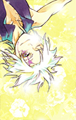
004
-Again, very visually appealing. The two main elements on either side balance the signature while the text in the middle adds to the signature instead of taking away from it. You can also see faded elements of Mamoru in the background and that adds a nice touch.
-Simple design yet complex at the same time, love the small details that you have to take second and third looks to notice (like the chibi mamo behind the hat), love the use of a real rose and top hat in the image instead of anime/manga art. While the text is light in color its still ledgable and flows well with the colors. Love the overall color scheme.
-I love the soft background the most and the color scheme is very elegant-like.
-I liked this one because it is simple and classy. I like the soft image in the background, but I would maybe make it a hair less transparent. Overall, great job.
-I like the background and the font, as well as the choice of images selected to match the theme.
-I love the hat and rose combo, and the font choice/ effects :)I love what you did with the rose, and the little symbol you put in between the quote. (Side note: would have liked it if both parts of the quote had the same alignment)
-The colours and imagery. It's all very romantic.
- Negative wrote:
001
-I still did like it, all of them are very nice. ^^ I think that the background could have used a little more work, though.
-I didn't hate this one. I thought it was original and the colors were well balanced. Only thing that jumped at me on this is the hat that is very different art style from the rose. I loved the rose that was chosen for this as it looked very artistic, almost dramatic and all this was smoothened by the light heart color for the background. The writing could have been just a little darker but I still like it this way. As for the hat, if it would have been a similar style to the rose I would have kept it but in this case, just the rose would have looked perfect alone.
-this is hard because I like them all
I like the hat and rose and feel it shows tuxedo mask, but the pinkish background kind of does not mix well in my opinion. Second place of the first ever LSMS Votes (both signatures): +3 ; -14 ; PC+4 = -7 - Positive wrote:
002
-I had a hard time choosing between 001 and 002 but I ended up choosing the second because of the mysterious atmosphere that characterize Tuxedo Kamen very well without necessarly having a picture of him. Every fan of Sailor Moon knows which character is the essence of this signature by the words chosen to identify him. I thought this signature was the one where everything, the graphic, the words, the atmosphere all matched very well together.
-I really like the contrast of light and dark as well as the texture the stars gives the graphic.
004
-I like the placing of the quote, as well as the chalk-style rose. - Negative wrote:
002
-Again, not a lot to show that it's referring to Tuxedo Mask. There are elements of him there, but not enough to give an outside viewer a clear understanding of the message.
-The only reason I chose this one is cause its the last one left. Its not my favorite, but I like the use of just the moon and earth. However, I feel the text could be improved, I find it hard reading the smaller text, especially since it seems like its intended to be read and not just used as like a texture or anything.
-Text is hard to read and I think there is enough space to enlarge it a bit for readability.
-It's a beautiful space-themed signature, but I think it may be a little too plain for the Tux quotes theme, could have used something more. I'd have liked to see a rose-shaped constellation, just to give an example.
-To be honest, I just picked this as my second least favorite because it was the only one left, hahah. I actually like it. Although, I would say that the first part of the quote is extremely difficult to read. Also, I would have liked to see a rose or something thrown in there to relate the images back to Tuxedo Mask. The space theme is relevant to the quote, but some little shoutout to him would have made it relate a little more.
-I really like the quote and the background, but they don't suit each other. I think maybe using that classic Tuxedo Kamen rose in the spotlight might do better for a background for this quote.
004
-Other than the "Now, Sailor Moon" part of the quote, there's nothing really in the signature to show that the artist is talking about Tuxedo Mask. There is a rose there but that could be for anything or anyone if one didn't understand the quote. We only get it because we've all seen Sailor Moon and know of Tuxie's elaborate quotes.
-Feels plain...just a Tuxedo Mask quote slapped on some texture. While I like the text chosen and the use of various fonts, they don't seem to harmonzie. Its overall just plain.
-There doesn't seem to be a specific flow of composition. The "Now Sailormoon" throws off the balance of the overall texts. Maybe avoid the angle text and leave it on straight, then minimize and place it above the "teach them..". Also be careful when cutting out or resizing (use shift) the rose because it seems pixelated and the ratio seems off. I do like the use of texture in the background though.
-I liked this one less because it felt a bit basic compared to the other ones. I also personally, don't care for the font. I'm really sorry it is just a quirk. The concept is really cute though!
-It wasn't all bad. The graphic is well done but to my eyes it looked to much of a school graphic. If the ''Now Sailor Moon!'' words weren't in there and if I wouldn't know Sailor Moon enough I would never know who that signature relies to. I liked the fact it remained simple though, nothing too flashy and the idea of the chalkboard with white writing was a good idea but I would have used this more for Usagi's teacher with another quote for example. I think it was just because I didn't recognize Tuxedo Kamen well in there.
-Arranged the words in a way that doesn't really draw me in-- my eyes don't know where to look first. The background and fonts don't have anything to do with Tuxedo Mask and could have been picked intentionally in order to portray a certain idea or theme, but they just seem kind of random.
-This one I like too, I get the green to symbolize the chalkboard. with the white text it is a classic, but just a bit plain for me.
-The background just seems a little bland and doesn't really work with the quote. I think maybe using a blackboard background with a rose or a chibi TK drawn on it might convey the humour of the quote better. It just seems like it should be a bit more silly. xD And now~ people's choice! Votes: +5 - Positive wrote:
003
The artist captured elements of Tuxedo Mask without actually stating, or showing that it was him. But it's still obvious that the subject is him. I find that very creative.
-Even though I like the first one the most, I feel the 3rd is a bit more creative just due to the resources used and the smaller details and textures used. Everything just flows so well with it. Its calming and very enjoyable to look at.
-I like the rose and the hat to symbolize the overall theme. It's very telling and I find that creative.
-Even thought this signature does not fall in my two favorite I think it was very creative. I don't know who the artist is but there are ideas, cool ones, in that head. They just need to be worken on to bring a perfect balance.
-With the textures and images, it just seems like a lot of work was put into this one. :)It's beautiful!
Second place People's choice - Positive wrote:
002
-This signature didn't just take a random Tuxedo Mask quote and put a picture of Tuxedo Mask on it. It picked an awesome quote and intentionally added the earth and the moon, which represent the quote. It's balanced really well and I can tell that whoever made it intentionally did this.
004
-This one thought out side the box and is really cute. The theme is very sweet. I also like how the dark green background and the soft white text look like a chalkboard from a schoolroom where you would learn the ABC's. Very nice.
-The chalk-style rose matches very well the quote chosen. I also like that different fonts and emphasis (larger) have been used for parts.
-heres where I eat my words lol
this one is super creative with the ABC's- because I want to become a teacher this one really struck me as cheesy as it is, but then again just about all of tuxedo kamens speeches are cheesy.
Congratulations!!! Hope you've learned something new and also had fun. the purpose of this contest was to help you improve your graphic skills. Thanks again for all contestans! and again sorry for the troubles! See you on the next contest on January 2014 ^^ #agcontest #ag
Last edited by Sailor Venus on 4th June 2016, 5:47 pm; edited 2 times in total |
|
Brit-chan Senior Member
Small Lady Emeritus
 
Title : Queen of the Cat Kingdom Posts : 23236 Join date : 2011-06-23 Age : 36 Location : Lafayette, LA
| | Subject: Re: [Contest] LSMS ~ Winners 8th December 2013, 1:33 pm | |
| Congrats everyone! |
|
mysteryloveandjustice Lotus Crystal
Title : GC's Official Seiya/Sailor Star Fighter <3 Posts : 2849 Join date : 2012-09-25 Age : 30 Location : Amidst the ancient pines
| | Subject: Re: [Contest] LSMS ~ Winners 8th December 2013, 8:38 pm | |
| |
|
Sailor Neptune Outer Senshi Admin
RP Graphics & Canon Admin
 
Title : Drinker of Roleplayers' Tears ~ The Internationaliest™ Posts : 9577 Join date : 2013-07-25 Age : 36 Location : Canada
| | Subject: Re: [Contest] LSMS ~ Winners 8th December 2013, 10:26 pm | |
| Thanks for all the votes, everyone ^^ I really love reading all the feedback. And thank you Haine for running this |
|
Aztnara Lotus Crystal
Title : Bad Wolf Posts : 1479 Join date : 2013-03-18 Age : 33 Location : Inside the TARDIS' library
| | Subject: Re: [Contest] LSMS ~ Winners 9th December 2013, 5:21 am | |
| Congratulations to the winners ![[Contest] LSMS ~ Winners 1955989781](/users/2914/10/33/88/smiles/1955989781.png) It was a really fun experience!~ and I hope next time we have more votes and more contestants ![[Contest] LSMS ~ Winners 1984953407](/users/2914/10/33/88/smiles/1984953407.png) |
|
PockyPants Pyramidal Crystal
Posts : 391 Join date : 2013-04-22 Age : 33 Location : Texas
| | Subject: Re: [Contest] LSMS ~ Winners 10th December 2013, 8:39 pm | |
| Congrats White Moon Lady!! <3 |
|
sunyeons Lotus Crystal

Title : that one j-idol and k-pop fangirl. Posts : 938 Join date : 2013-08-12 Location : pink ocean
| | Subject: Re: [Contest] LSMS ~ Winners 14th December 2013, 5:16 pm | |
| |
|
Sponsored content
| | Subject: Re: [Contest] LSMS ~ Winners | |
| |
|


![[Contest] LSMS ~ Winners 1eMuk9F](https://i.imgur.com/1eMuk9F.png)
![[Contest] LSMS ~ Winners 4xUpZ4Q](https://i.imgur.com/4xUpZ4Q.png)