| | [Critique] Bumper Thoughts |    |
|
| Author | Message |
|---|
Starchild Lotus Crystal
 
Title : GC's Official Leek & JunJun/Sailor Juno Posts : 3220 Join date : 2012-11-19 Age : 32 Location : In the Diamond Sky
![[Critique] Bumper Thoughts Empty](https://2img.net/i/fa/empty.gif) |  Subject: [Critique] Bumper Thoughts Subject: [Critique] Bumper Thoughts ![[Critique] Bumper Thoughts I_icon_minitime](https://2img.net/s/t/21/09/42/i_icon_minitime.gif) 27th April 2017, 9:55 pm 27th April 2017, 9:55 pm | |
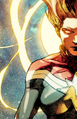
| So, I'm going to be hosting a new monthly Sailor Moon activity. ![[Critique] Bumper Thoughts 2422052349](/users/2914/10/33/88/smiles/2422052349.png) I am using an older version of photoshop, so I don't do bumpers the short way like Venus does, I have to go the long way [basically drawing the circular portion myself and using layers and swearing at my computer because I only use a track pad and no mouse XD ] But anywhoo, I feel like this looks okay, but since I can't seem to be satisfied with it, I need some input. I also realize the upper left corner is not transparent, but that will be fixed. ![[Critique] Bumper Thoughts Vsghqxj](https://i.imgur.com/Vsghqxj.png) I think what I'm having the most issues with, personally in my preferences, is the colors and text placement. I wanted to get some other people's opinions before I finish completely and prepare the game and it's prizes. Thanks everyone! ![[Critique] Bumper Thoughts 4122659016](/users/2914/10/33/88/smiles/4122659016.gif) |
|
 | |
Sailor Venus Inner Senshi Admin
Media Director
Title : AKA Haine~ the official hardcore UsaxMamo fan Posts : 3584 Join date : 2012-09-24 Age : 36 Location : The Echanted forest looking for my unicorn pet
| | Subject: Re: [Critique] Bumper Thoughts 28th April 2017, 8:25 am | |
| Nice job star!
My observations are these:
1. The font doesn't match very much and takes a lot of space in my opinion, if you like that "square-ish" style I could suggest my favorite font Ernest and remember to set it up in none, it looks a little blurry. Text placement is fine, but maybe another font.
2. The gradient used doesn't match very well with the colors of the font and with the pixel pencil, I'm not sure of the vision you had with this but it's a good start but maybe changing a few things would make you feel more satisfied with it. |
|
| | |
Starchild Lotus Crystal
Title : GC's Official Leek & JunJun/Sailor Juno Posts : 3220 Join date : 2012-11-19 Age : 32 Location : In the Diamond Sky
| | Subject: Re: [Critique] Bumper Thoughts 28th April 2017, 8:43 am | |
| Thanks! I just picked a gradient to show the pencils, to be honest. I was absolutely going to fix that, haha.
Visitor has been the only pixel font I've used for awhile, so I'll look up Earnest. Hopefully it's not as blocky as this one. I totally forgot to set it to none also. XD
Thanks for your input! This is a style of bumper I'm not used to making XD |
|
| | |
Brit-chan Senior Member
Small Lady Emeritus
 
Title : Queen of the Cat Kingdom Posts : 23236 Join date : 2011-06-23 Age : 36 Location : Lafayette, LA
| | Subject: Re: [Critique] Bumper Thoughts 28th April 2017, 10:08 am | |
| Venus pretty much said what I was thinking. I'm not exactly sure what Diana or Celest use for the pixel font on bumpers they make, so you might want to ask them if you are looking for that one in particular? I also use the font Silkscreen often for pixel font.
I think my only other critique would be the cropping of Usagi's face. Maybe its my personal preference, but I don't really like how the left eye is cut off by the pencil. Maybe centering it would be a bit better? Or scaling it down a bit more? It just seems off to me.
Also, I know Venus mentioned the colors already but I don't find the color of Usagi really fits well with the pencils. How did it look with the original colors? Maybe if you put a border around Usagi with the pencils and text falling on the border, it might seem more cohesive?
Also totally feel you on the pain of having to make your own corners. I did that for the longest time. ;-; |
|
| | |
Diana Inner Senshi Admin
Graphics Director
 
Title : Ally-Cat ♡ॢ₍⸍⸌̣ʷ̣̫⸍̣⸌₎. Wolf-sissy to yunbuns. ♥ Posts : 3314 Join date : 2014-12-17 Location : Central Europe
| | Subject: Re: [Critique] Bumper Thoughts 28th April 2017, 10:32 am | |
| Totally agree with Vbabe and Brit. The colors do not really match well with the pencils and the gradient of the text's contour. I too would like you to attach the original picture in order to figure out matching colors :3.
Regarding the cropping: Advocating Brit's opinion on that matter; I indeed would center the picture of Usagi. But then again, as Brit already mentioned, it's a personal perception.
Fonts: I use Handy00 for ANY bumper graphic I create. It's the most fitting one in my opinion. And for the contour I usually use default colours (no gradient, unless it's fitting to it's theme).
I would HIGHLY appreciate you to share the original picture though..... I want <.< >.> |
|
| | |
Starchild Lotus Crystal
Title : GC's Official Leek & JunJun/Sailor Juno Posts : 3220 Join date : 2012-11-19 Age : 32 Location : In the Diamond Sky
| | Subject: Re: [Critique] Bumper Thoughts 28th April 2017, 10:47 pm | |
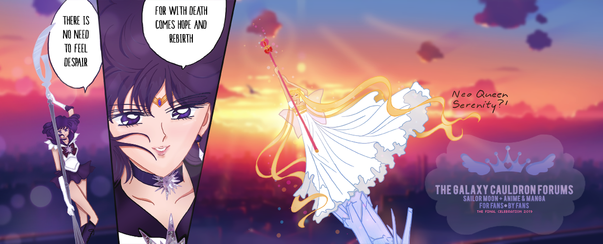
| Okay, so, now that it is no longer the middle of the night XD I have made some changes. I love this a lot better. I have downloaded the reccomended pixel fonts, as I like them a lot more than visitor, which I used to use for userbars. The issue with the first image is it couldn't be centered, but here it is regardless. <3 - Spoiler:
I have decided to completely go in a different direction ![[Critique] Bumper Thoughts T17FwTH](https://i.imgur.com/t17FwTH.gif) I am much more pleased with this. |
|
| | |
Brit-chan Senior Member
Small Lady Emeritus
Title : Queen of the Cat Kingdom Posts : 23236 Join date : 2011-06-23 Age : 36 Location : Lafayette, LA
| | Subject: Re: [Critique] Bumper Thoughts 29th April 2017, 9:24 am | |
| OOoh yeah I was wondering if that screenshot was actually cut off, I couldnt' recall the exact scene. XD I really love this one tho!! It's really cute and the colors match much better.  Sometimes just completely redoing a thing can make it come out much better. xD I have done that a many times before. |
|
| | |
Sponsored content
| | Subject: Re: [Critique] Bumper Thoughts | |
| |
|
| | |
| | [Critique] Bumper Thoughts | |
|


![[Critique] Bumper Thoughts K2bsrHg](https://i.imgur.com/k2bsrHg.jpg)

